CONCEPT DEVELOPMENT
As a copywriter and a creative director, I’ve built a career of creating big ideas that demonstrate the single differentiating benefit or attribute outlined in the creative brief. Ensuring that the idea is on strategy and on brand is an absolute must. It’s also important to create an idea that’s Relevant, so it matters to the customer, Unexpected, so it gets their attention, and Like-able, so people remember it and talk about it—and most importantly, feel affinity for the brand.
Oracle Cloud ERP
I was tasked with creating an awareness campaign for Oracle Cloud Enterprise Resource Planning (ERP) that generates urgency among enterprise C-suite executives to move their business to the cloud. The single differentiating benefit: CIOs, CFOs, and COOs should move to Oracle Cloud ERP because it’s a complete enterprise cloud designed to modernize your business.
My concept: Adapt or get left behind
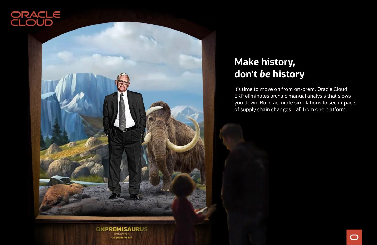
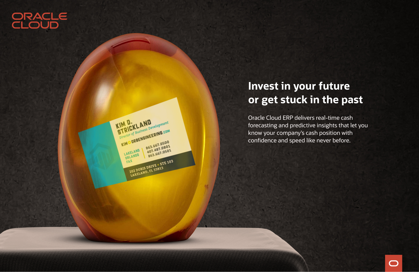
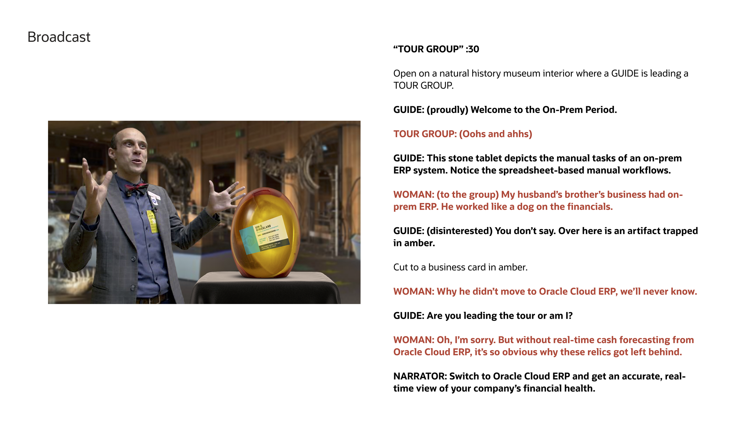
I wanted the audience to recognize that Oracle Cloud ERP is vital to their business success and survival. I used hyperbole to demonstrate the benefit. The idea of a business stuck in prehistoric times conveyed the risk of staying with on-premise applications and generated urgency to act. Like a strong campaign idea should, it lent itself to an array of executions for print, radio, TV, social, digital, event display, and geurilla tacticts. We knew we were onto something—an idea that’s Relevant, Unexpected, and Like-able.
Print Ad. Art Director: Patrick Moore
Event Display. Art Director: Patrick Moore
Print Ad. Art Director: Patrick Moore
Print Ad. Art Director: Patrick Moore
Video: Art Director: Patrick Moore
Starbucks Custom Frappuccino
Every summer at Starbucks, the focus shifts from hot beverages to cold, slushy Starbucks Frappuccino blended beverages. The strategy: you should get a Frappuccino because you can customize it to reflect your personal taste.
My concept: Uniquely blended, like you.
Instead of focusing on choices, like dairy or non-dairy, whip or no whip, chocolate or vanilla, etc., (which was the norm), I wanted to take a different approach and express that people are unique blends. Everyone has different tastes, interests, style, and personality. Your Frappuccino is a unique blend, too—as unique as you are. I demonstrated the benefit through a visual concept that was unexpected and engaging. Note the nod to the Starbucks siren, who also happens to be a unique blend, part human and part fish. The campaign is a rally cry to own your uniqueness, own your blend, and have some fun. It is summertime, after all.
OOH. Art Director: Jeff Ashley
Transit Station
Transit
Wild Postings
Washington Mutual Bank
Seattle used to have a great bank called WAMU. They wanted to run a campaign that shared a local connection and their sponsorship of the Seattle Mariners.
My concept: Go visual with the partnership
This idea came from a conversation with my art director partner. Shout out to Thad Tichenor, for his simple art direction approach and super complex Photoshop skills.


